Just like to share the latest mini I finished:
Looks slightly better in my display cabinet.
Cheers.

I'm sure it also looks biggerjunex wrote:Looks slightly better in my display cabinet.
Thanks!Nameless wrote:welcome to the forum
Actually looks slightly smaller in my cabinet, maybe that's why it looks slightly better...hahahaNameless wrote:I'm sure it also looks biggerany change for a bigger pic of that mini?
 Click to see full-sized image
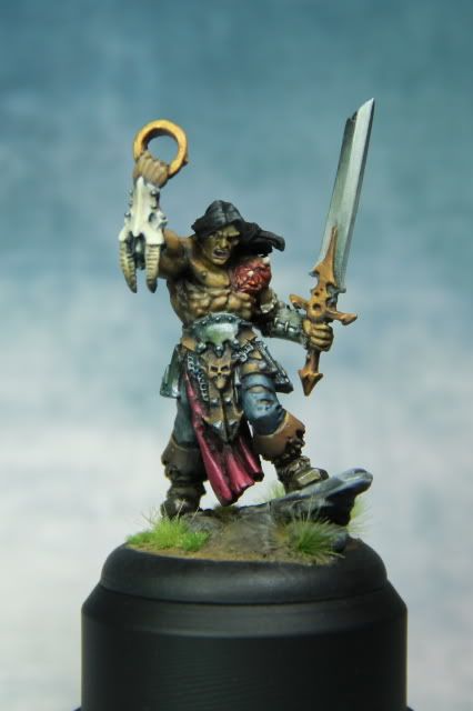
 Click to see full-sized image
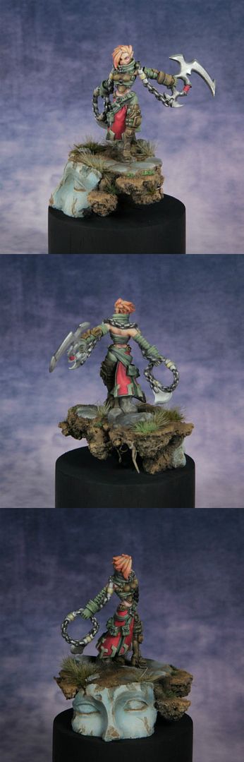
ther is nothing assubtele contrast in this scale - i biger possible or in monohrone works but when you mix oposite colors (actualy caled complementary) as red end green you alrdy made hardest posible contrast so rest must be as contrasting or it will look dull end unintrestingAs for the Mage Hunter Assassin, I was trying for a more subtle contrast on the weapons but it may have been too subtle...hehehe.
I have the 18-135mm f/3.5-5.6 kit lensMaru wrote:you got ther quite good camera
but a bit blury .. what lences you got ther ? (if i knew i mey be able to help tiune them up )
I've had similar comments on the gold and I believe I made adjustments (though I still think it needs a bit more work) but I didn't take pictures of the final result.Maru wrote:on barbarian mini i caind of like sworld but not "gold" part as it actualy looks like plastic part not iben other metal part - metals got much highrt contrast iven duled ones wil shine in this special way
beside - skin - nuances in mid tones - add them
Looking at the mini again, it seems that it was actually my first attempt at NMM.Maru wrote:sorceres .. - suno about metals dont c eny actualy better but gem looks realy good
is ther a chance fora biger or better photo of this 1 ??
 Click to see full-sized image
I think I understand what you mean with the contrast. Will look for the color theory tutorial.Maru wrote:ther is nothing assubtele contrast in this scale - i biger possible or in monohrone works but when you mix oposite colors (actualy caled complementary) as red end green you alrdy made hardest posible contrast so rest must be as contrasting or it will look dull end unintresting
i think we get somwer hear a color whell tutorial .. i think
 Click to see full-sized image
 Click to see full-sized image